Test 3: Posters
New Method—
1.
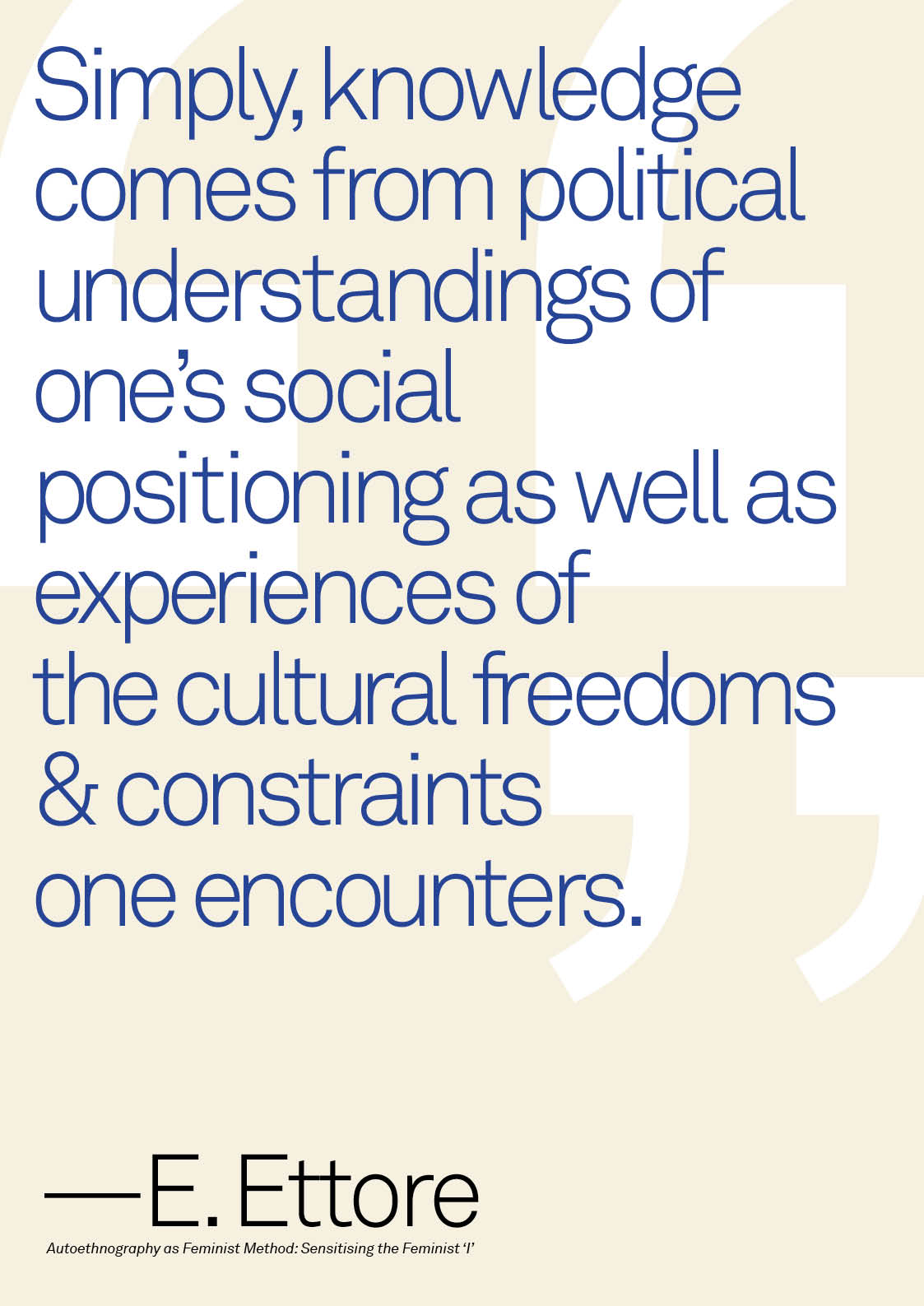
Choose quote from literature review.“Simply, knowledge comes from political understandings of one’s social positioning as well as experiences of the cultural freedoms and constraints one encounters.” (Ettorre, 2017, p. 2)
2.
Design poster & screen record process of “default” designing.
i.e. designing without overthinking – tacit knowledge.
i.e. designing without overthinking – tacit knowledge.
3.
Reflect on decisions made during.1. Compared “g” in Helvetica, Akzidenz Grotesk, Akkurat, and Futura because they are the standard typefaces that people don’t generally say anything negative about.
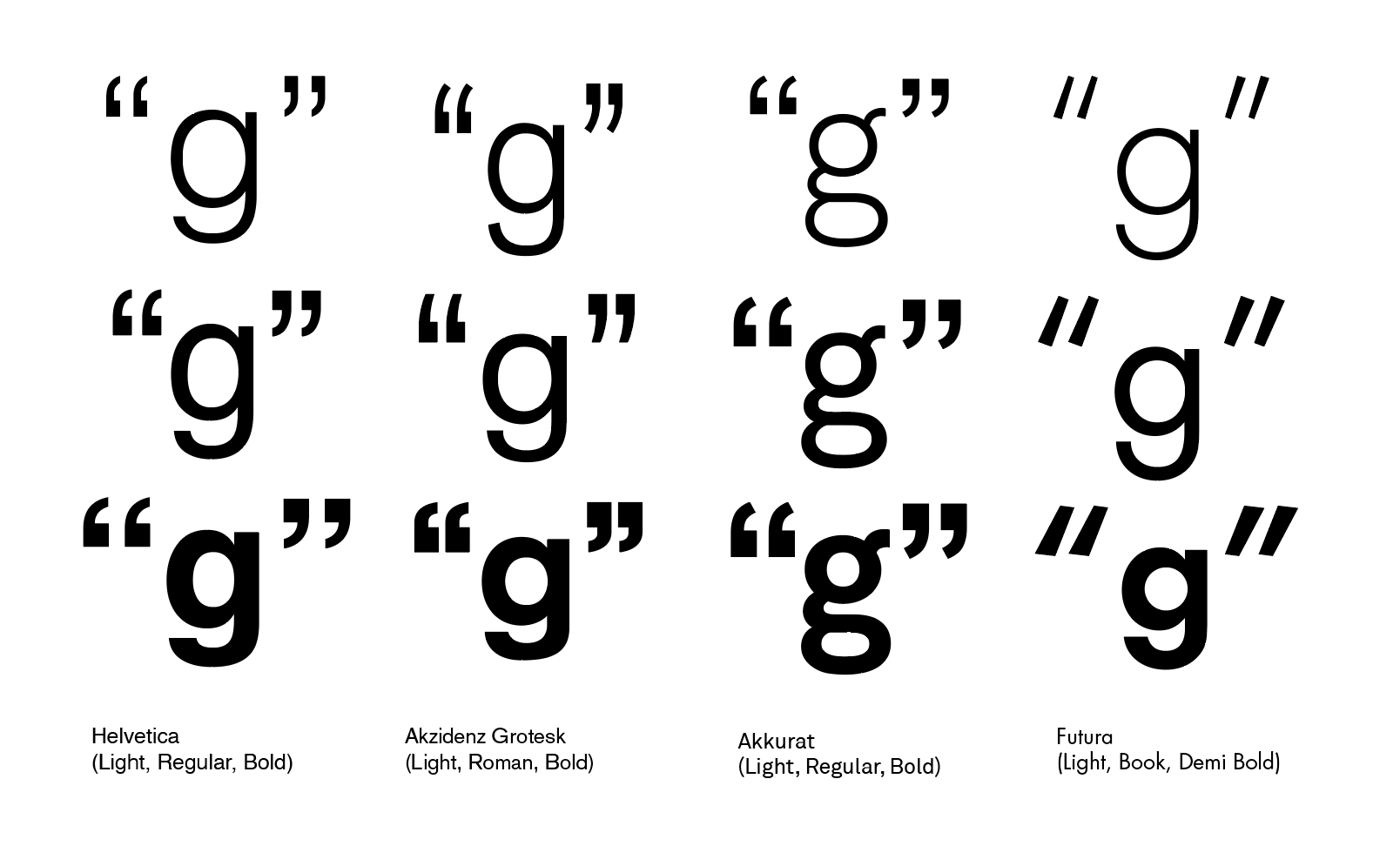 2. Chose Akkurat because I preferred the loop in the lowercase g.
 3. Weight: Light instead of Regular or Bold because the “colour” of the page would be too dark with a long quote.
4. Immediately turned off hyphenation because it’s difficult to read words that are cut.
5. Debated between turning on Optical Margin Alignment or removing the quotation marks.
6. Chose to remove quotation marks because otherwise a left aligned body of text would have an awkward space underneath the quotation marks, without any tension in the space to hold its place.
7. Enlarged the quotation marks in separate text boxes to allow more freedom in movement and outlined to use as a background element.
8. Adjusted the rag of the words on the right according to the in and out pattern, then tried sense breaks but the words were too long. Went back to in and out.
9. Kerned all letters judging by the negative space between and around the letters. First at a more zoomed out view, then zooming in for a closer look, zooming out once again to maintain visual rhythm and harmony in the piece.
10. Tested different colours. Red, black and white is a safe bet, so is the Swiss orange with white on top, but I couldn’t find an orange that looked right. Instead I went with a cream background and dark blue text on top because I once made a pattern with those colours and it looked nice.
11. Intended to include all bibliographic information but there wasn’t enough content to give it weight, especially at a small size.
12. Used the initial and last name of the author instead at a larger size with the title underneath.
13. Added an ‘em’ dash (—) instead of ‘en’ (–) or a regular dash (-) because after quotes it’s more commonly seen or perhaps I read it in Bringhurst’s Elements of Typographic Style.
4.
Post-rationalise.
As this is an initial test I am still unhappy with it. To improve I would try turning on hyphenation, heavier weight and somehow make the information more in conversation with the quote on top. The technical aspects of setting typography overcame the aesthetics in this particular test. Many technicalities were learnt from reading Elements of Typographic Style as well as an Advanced Typography class in SVA where we spent most of the year learning how to make every space perfect.
5.
Define what makes it “perfect”.
It is portrait oriented.
Big element [text] with smaller caption underneath (classic advertising layout).
It is portrait oriented.
Used Akkurat (designed by a Swiss typographer).
Text starting at top left corner.
Set in upper lower case.
Set in upper lower case.
Contrast in scale (quotation marks in background).
Kerning and leading are overall harmonious in spacing.
Consistent size in typography and aligned baselines.
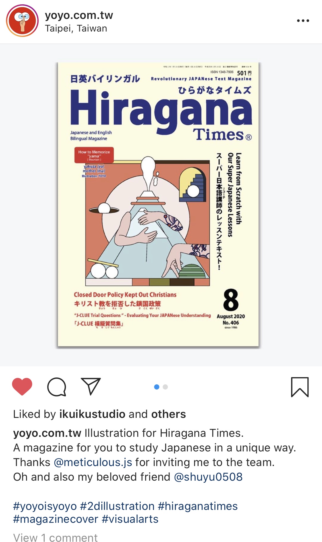
Colour combination seen quite commonly. Coincidentally, my designer/illustrator friend posted this photo (below) of the same colours being used on a Japanese magazine cover made for people to learn the language.
6.
Create new poster that’s “imperfect”.